

UX & Product Design Week
Conference
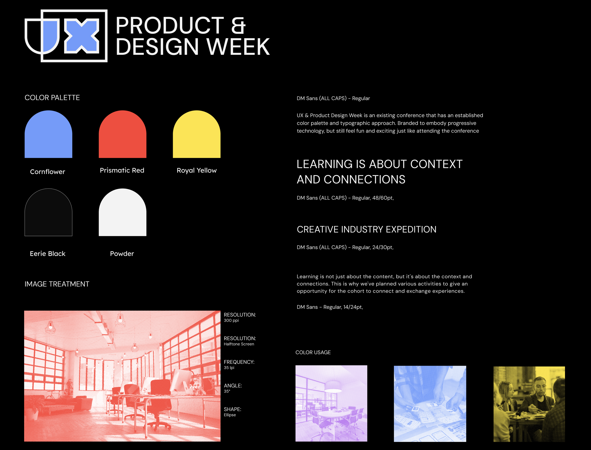
Design

UX & Product Design Week is an annual conference hosted by Future London Academy. It immerses participants in London’s tech and creative industry where they will attend workshops, office tours, lectures and fun activities for networking oppertunities
Project Duration: 5 weeks, Fall 2023
Tools Used: Indesign, Illustrator, Photoshop, Figma
Project Overview: UX & Product Design Week is an established conference that occurs annually. Create new Web and Mobile designs for this years event.
Goal: To create a rescale for the 2023 UX & Product Design Week, using an existing color palette and style created by Future London Academy.
Outcome: I rescaled the UX & Product Design Week conference, both on web and mobile formats. Along with the digital experiences, I created several touch points to go with the in person aspect of attending a design conference.
Project Scope:
Visual Identity
Web & Mobile Design
Art Direction
Home page
Web & mobile
The home pages tells the story of how the conference will work. Users learn the structure and events that will be happening throughout the weekend without having to navigate their way through multiple pages.
The mobile layout is a condensed version of the web. The information is still the same, but the keynote speakers has been restructured to fit the small screen size.
Expanding Cards
Web & mobile
This specific example of the expanding cards shows how users can get more information on a daily workshop. Again focusing on keeping page to page navigation to a minimum.
The cards expand the same way on mobile as they do on the desktop. This example shows how the keynote speaker card condenses when on the mobile screen.
Lecture Archive
Web & mobile
UX & Product Design Week is an annual conference that records their speakers to create an archive. From the archive users can watch past years lectures and get information on the work of the speaker.
The mobile version doesn’t differ much from the desktop. Instead of a side bar, the mobile features a hamburger menu to make best use of the limited screen space available.
UI Elements

Brochure


London Underground Ad


ID Badges

what i learned:
Doing this project, I learned more about navigation and how to keep the user primarily on one page. I also learned a lot about formatting the same content from web to mobile.
With more time I would like to continue developing more screens and experiment more with animations and interactivity.
with more time:
Other Projects:

Bigfoot

Hyperbolic Realities

Wayformer